# Quick reply button
Defines that step will wait for visitor to click one button from the set.
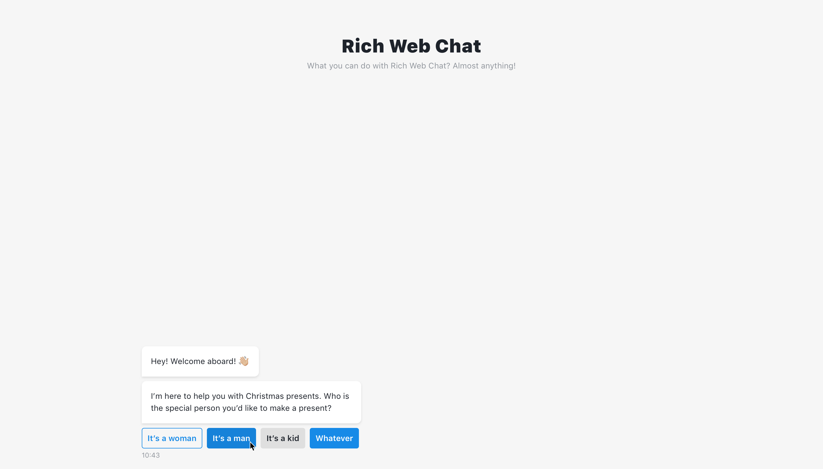
Multiple buttons can be defined via add button, but only one can be selected by the user. The button label field is required, its input will not be truncated if exceeded and will be added in full to the output. The button value input must be unique for each button, and is also included in the output.
# Button style
Button style can be changed by selecting one of the styles:
Default- selected by default as suggested by chat design for current component. For quick reply button will be outlined.Outlined(first button on screen above)Filled(second & fourth button on screen above)Custom(third button on screen above) - allows to change button style using custom CSS. By default this button appears grey.
TIP
Default & Outlined are the same button style.
# Code mode
In code mode buttons can be defined as array of objects:
[
  {
    label: 'button 1',
    value: 'button value 1',
    buttonStyle: 'default'
  },
  {
    label: 'button 2',
    value: 'button value 2',
    buttonStyle: 'filled'
  },
  {
    label: 'button 3',
    value: 'button value 3',
    buttonStyle: 'outlined'
  },
  {
    label: 'button 4',
    value: 'button value 4',
    buttonStyle: 'grayed'
  }
]
# Output
The structure of the output is:
{
  label: '',
  value: ''
}
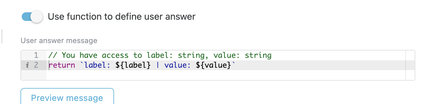
# Use function to define user answer
Allows to override default answer by custom message.
# Available variables
The same as output example.
{
  label: '',
  value: ''
}
# Example
return `label: ${label} | value: ${value}`
# Step configuration:
# Result: