# Custom template
Use this type of input components to create custom solutions that can't be covered by default inputs.
Examples: integration with external libraries (payment systems, UI libraries for data visualization), components that require several user interactions.
# Text message
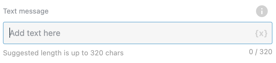
Not required. Text from the field will be sent to RWC at the beginning of your custom template. Use it to describe your custom component or as help text for the user.
# Custom template library
Custom templates (both Vue and HTML) can be saved into the templates library and can be reused in other Request Response (RWC) steps.
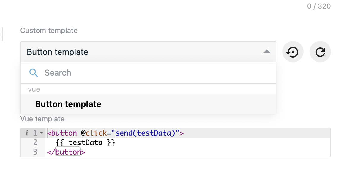
You have dropdown with the custom templates that are already saved to the account library (in case if account does not have any saved templates options will be empty). Options divided into two categories which are vue and HTML. Options in these categories indicates that template was saved as vue or HTML type respectively.
When changing template you can revert changes by clicking on the button right to the dropdown. This will change template inputs to the state that is saved in the library.
When you saved template in another step and want to reuse in current step you can press refresh button which is right after Revert changes button. This acttion will load/update template in your list.
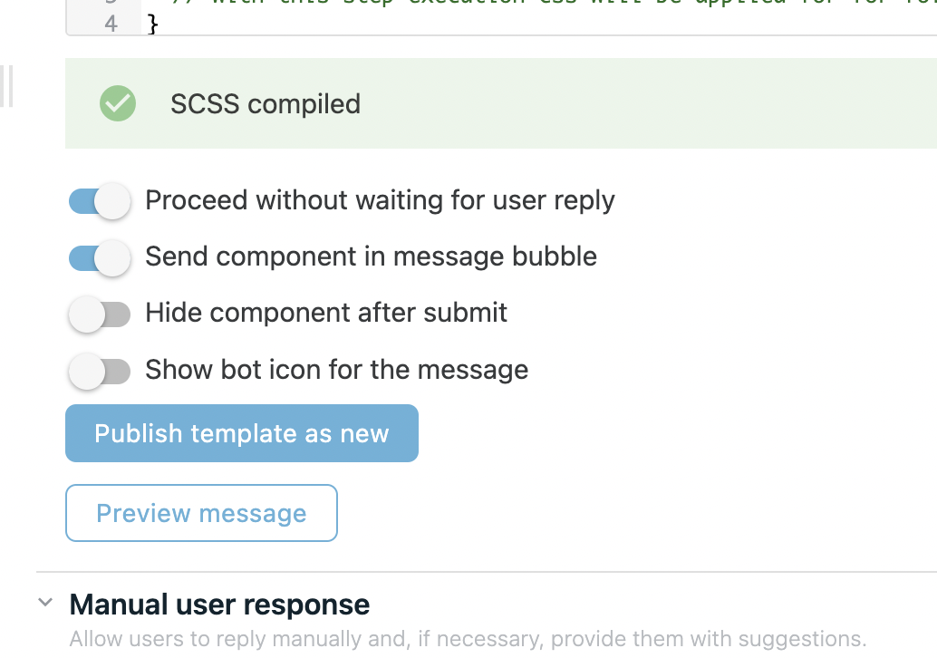
In order to publish template to the library you need to scroll down and find Publish template as new button. By pressing you will be asked to give a name to this template.
| Publish template button | Prompt |
|---|---|
 | 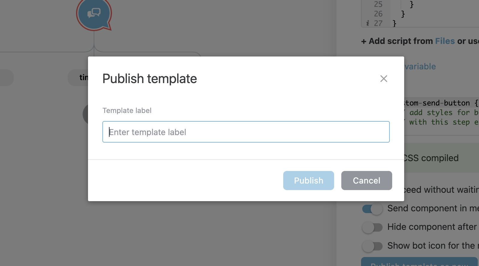 |
After you filled the template name in the input you can press Publish button and template will be saved to the library. After template was published it will be selected from templates dropdown automatically and can be published as new template, updated and deleted.
By clicking Publish as new you will save this template to the library again, this might be usefull when you have similar templates with slight difference that should be in the library.
By clicking Update template you will update this template in the library.
By clicking Delete you can delete this template from library.
WARNING
When updating template in the library this will not automatically update this template in other steps, you have to go through steps and re-select this template from list. When template is selected from list it only populates inputs with Vue template, HTML, CSS, JS and template settings.
# Custom template type
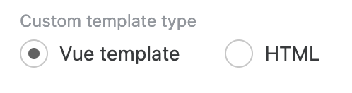
Use it to define in what code style your component will be. There are two options to build your custom component:
- Vue template - Vue single file component;
- HTML - plain HTML + CSS + JS.
# Vue template
This type is presented as one code field. By default, custom component code contains a button and after click on this button message will be sent.
By default vue component will look like this:
return {
  template: {
    template: `<button @click="send(testData)">{{ testData }}</button>`,
    data() {
      return {
        testData: 'test data'
      }
    },
    props: {
      readonly: Boolean, // true if message is sent
      loading: Boolean, // true on message sending and false when message received in chat
      isInPreview: Boolean, // true if message is in preview mode
      isMessageLast: Boolean // true if current message is last in chat and false on next message sending
    },
    methods: {
      send(msg) {
        /**
         * `message` field will be sent as user reply and will NOT be stored in mergeField
         * `myData` field will be stored in mergeField
        **/
        this.sendMessage({
          message: msg,
          myData: msg
        });
      }
    },
    // mounted () {
    //  if the component does not require user interaction, you can send a message when the component mount
    //  this.sendMessage()
    // },
    computed: {}
  }
}
TIP
Full information about vue component structure you can see here (opens new window)
# props
There are helpful props that can be used to change component state after some user actions:
readonly:Booleanrepresents message state, becomes true if message is sent;loading:Booleanbecomes true of message is sending;isInPreview:Booleantrue if message is showed in preview window;isMessageLast:Booleantrue if message is currently the last in messages flow in chat. Becomes false when user replies or another message is recieved;
TIP
Custom variables will be merged to props object automaticaly
TIP
Full information about props you can see here (opens new window)
# this.sendMessage function
In order to reply you need to call this.sendMessage method.
You can call this method with different set of arguments:
this.sendMessage()will reply without sending user reply message;this.sendMessage('text message')will reply with message bubble which will containtext messagetext;this.sendMessage({ message: 'text message', myData: {} })will reply with message bubble which will containtext messagetext andmyDatafield which will be stored in mergeField on flow, can be any type;
# HTML template
This type is presented as three code fields. By default, custom component contains a button and after click on this button message will be sent.
# HTML
HTML template contain a single button with custom-send-button class and custom-button id.
<button class="custom-send-button" id="custom-button">send</button>
TIP
Button id should be unique throughout all custom components in your chat.
# Javascript
// readonly <Boolean> - true if message is sent
// loading <Boolean> - true on message sending and false when message received in chat
// isInPreview <Boolean> - true if message is in preview mode
// isMessageLast <Boolean> - true if current message is last in chat and false on next message sending

const testData = 'test data';

const btn = document.getElementById('custom-button');
btn.addEventListener('click', send);

function send() {
  /**
   * `message` field will be sent as user reply and will NOT be stored in mergeField
   * `myData` field will be stored in mergeField
  **/
  sendMessage({
    message: testData,
    myData: testData
  });
}
# Default variables
There are helpful global variables that can be used to change component state after some user actions:
readonly:Booleanrepresents message state, becomes true if message is sent;loading:Booleanbecomes true of message is sending;isInPreview:Booleantrue if message is showed in preview window;isMessageLast:Booleantrue if message is currently the last in messages flow in chat. Becomes false when user replies or another message is recieved;
TIP
Custom variables will be merged automaticaly and will be avaiable as global variables.
# Default functions
In order to reply you need to call this.sendMessage method.
You can call this method with different set of arguments:
sendMessage()will reply without sending user reply message;sendMessage('text message')will reply with message bubble which will containtext messagetext;sendMessage({ message: 'text message', myData: {} })will reply with message bubble which will containtext messagetext andmyDatafield which will be stored in mergeField on flow, can be any type;
# Third party scripts
There is an option to add third party scripts and libraries, choosing from OneReach Files or adding URLs. These scripts will load asynchronously on client.
# CSS
Unlike vue template, you can specify additional styles for component.
.custom-send-button {
  // add styles for button
  // with this step execution css will be applied for for follow-up messages of the flow
}
TIP
Class names are not scoped, so consider giving unique names. Also, you have access to css classes defined in Wait for chat step. You can reuse class names of previous components in your chat if you have one.
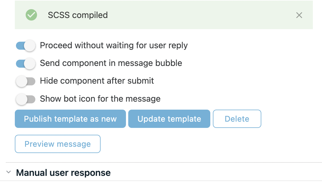
# Enable to proceed without waiting for user reply
This switch allows to send message immediatly if component does not require any user interactions.
# Enable to send component in message bubble
This switch allows to render component in bubble as part of message. If switch if off custom component will be rendered as standalone.
# Enable to hide component after submit
This switch allows to hide component after it was subbmited.
TIP
When enabling this option along with Enable to proceed without waiting for user reply switch message will disappear immediatly.
# Enable to show bot icon for the message
Allows to show bot icon next to message bubble or custom component (in case custom component rendered outside message bubble).
# Custom variables

Used to send data from Flow to RWC Client. Here you can define extra variables and then use it in custom component code.
For example let's add dynamic parameter appId as variable:
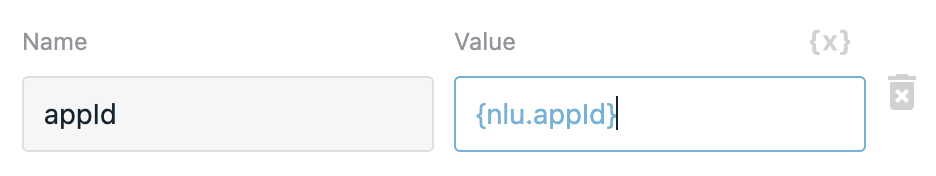
now we can use it in component code.
# Output
Output is dynamically defined in function which sends message through property myData (or any other property name except message which is reserved name for message text which will be shown in user response).
// when using HTML template method name will be sendMessage, not this.sendMessage
this.sendMessage({
  message: 'Component submitted',
  myData: {
    someProp: 'someValue'
  },
  myData2: 123
});
In this case output example will be:
{
  myData: {
    someProp: 'someValue'
  },
  myData2: 123
}
# Example
Request Response (RWC) step configuration:
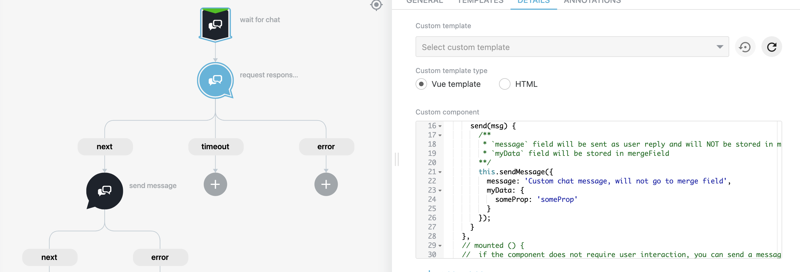
In this case this.sendMessage method has message prop with message that will be shown in user reply after component submit and
myData prop that will pass custom data to merge field.
Send Message (RWC) step configuration:
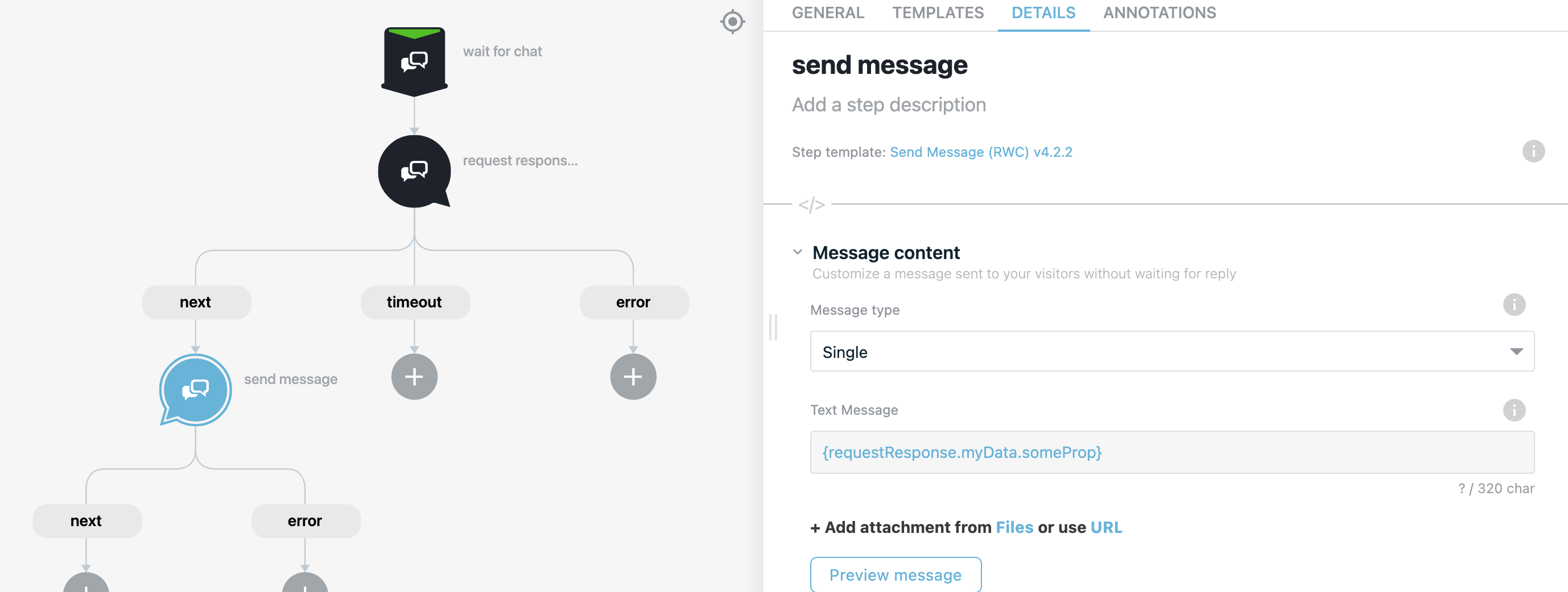
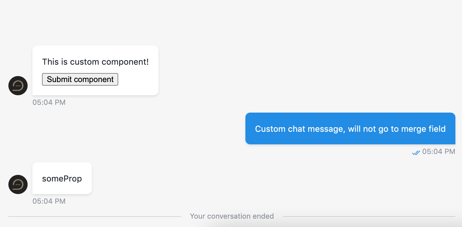
Result:
# Use function to define user answer
Custom user answer is not available with custom component. Message can be specified using this.sendMessage (or sendMessage when using HTML type of custom component) method which accepts object with message property that will be used as user reply text. Example how to specify custom message you can find here.
← Credit card Date →